

Appendix B: Analysis of Surveys
Figures 1.1, 1.2, 1.3, 1.4, and 1.5 are graphs based on the results of a survey that our group sent to individuals throughout IUPUI’s campus. Most recipients of the survey were students, however, the survey was shared with a smaller population of different age demographics which is shown in Figures 1.3 and 1.4. Each recipient of the survey responded to each question resulting in their feedback being used for each graph. This survey asked questions specifically to individuals, however, we sent a survey targeted towards organizations that will be discussed later in Appendix B.
Survey Results: Analyzing Personal Data
Awareness of community events is the most important way of receiving engagement for the event, because at the end of the day there would be no engagement if no one knew about the event. Figure 1.1 shows the most effective ways of reaching out to a demographic of 18-23 year olds. The most effective way is social media. People most often use social media, which allows them to hear of events quickly and on time. Flyers and print ads are also very effective since it gets the information into the hands of the donors. Flyers and print ads would also be effective in a work environment, which would combine the second and third most effective ways to reach people. TV and radio are not very effective anymore due to music apps and streaming services.
Figure 1.1: Most common way to become aware of community events.

Figures 2.1, 2.2, 2.3, and 2.4 are graphs based on the results of a survey that our group sent to non-local organizations. Most recipients of the survey were large organizations, however, the survey was shared with smaller businesses and charities as well. All of the companies that were contacted for the survey have an interest in donating to charitable organizations, or have made donations before. Each recipient of the survey responded to each question resulting in their feedback being used for all four graphs.
Survey Results: Analyzing Company Data
The first graphic we would like to show you in terms of partnership is Figure 2.1. This graph shows the likelihood of these companies partnering with the Mars Hill Charity Riders. The majority of responses chose “maybe”, but that does not mean it is a bad thing. Most organizations would need more information before making a clear answer. This shows promise because 88% of respondents would consider partnering with charities. This is not a guarantee, but it does show that success in finding partnerships is likely as long as it is a good fit for both sides.

Figure 2.1: Pie graph representing the likelihood of organization partnership.
Organizations typically have a strong preference when it comes to getting to know their charity partners. Many companies like to establish contact ahead of time before they offer a monetary donation. According to the organizations we contacted most only need 1-3 months of contact before donating. Some, however, would like to be in touch for over a year first. This makes it important to communicate with your partner before creating expectations. Pairing this information with the information on Figure 2.1, it shows the importance of reaching out in order to change that “maybe” to a “yes”.
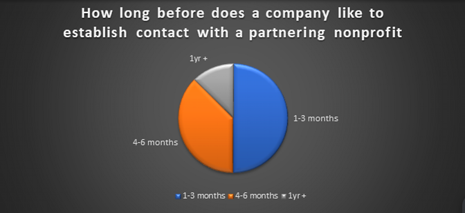
Figure 2.2: Pie graph representing the time required by organizations before donating to charity.
Volunteering and resource donation are the most common interactions between businesses and charities. Financial donations are common but potentially not as common as initially thought. This is important when reaching out to businesses, because they may attempt to donate resources that are not useful to your charity. Volunteering can be helpful when hosting large events that must be put on at low cost. Figure 2.3 shows the variety of ways companies donate to charities.

Figure 2.3: Represents the willingness of company interactions with non-profits in various ways.
Out of the businesses and organizations that we contacted, Figure 2.4 shows that education, youth issues, personal wellness, and military/veterans services are all ideal areas of focus for donations. This relates well to the Mars Hill Charity Riders, which reveals that many companies have the same focus as your charity. This does not mean that they are guaranteed to donate, but it is positive information when looking to start partnerships with businesses and organizations.

Figure 2.4: Reveals organizations most ideal areas of focus when donating to charities/non-profits.
Following Figure 1.1, Figure 1.2 shows where this age demographic feels most comfortable donating to. There is a balance of results on this graph, which is great for a charity. This means that anything from social media ads to school fundraisers can be effective ways to engage donors. Social media did have the lowest preference, which is likely due to the fact that the cause advertised was not personal to the donor. Community events, school fundraisers, and charity rider events are voluntary, making them personal to all who choose to attend.

Figure 1.2: Common preferences towards donating.
Figure 1.3 reveals which social media platforms are most used by different age demographics. The younger age demographic had the highest engagement rate of the survey making the other age demographic results slightly skewed. Tiktok and Instagram are the most popular amongst the youngest demographic. The older people get the less it appears that TikTok and Instagram are used, but FaceBook and Twitter/X are still good options.

Figure 1.3: Social media platforms most commonly used by different age demographics.
Many people rarely or occasionally donate. Some who rarely or never donate may have financial difficulties of their own making it difficult to donate. Those who do donate respond by saying that they spontaneously, or occasionally donate. It is important to explain the cause of the donation request in order to attract donors who may even donate just for the simple fact that they were in a good mood that day. Volunteering is another way to use community involvement to the advantage of the charity, which is shown below in Figure 1.4.
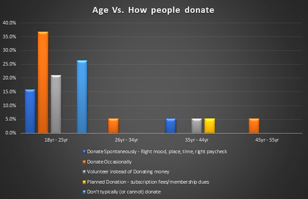
Figure 1.4: Reasons why people donate based on age demographics.
Figure 1.5 shows similar information to Figure 1.4, but it does not take into account age demographics. This graph may be easier to visually comprehend, as it is important to look at all data from many angles. This pie graph shows a percentage relating to how often people donate for that particular occasion. It shows that the majority of people donate occasionally at 37%, and 21% of people would rather volunteer than donate. This gives options to charities, allowing them to offer volunteer work that could be beneficial to both parties.
